" height="14.062500505751508px" id="uXHscogcx" transform="translate(0 15.5)" width="44.99999937402862px"/></svg>)
SYLP
SYLP
Sylp is a fashion brand based in Mumbai that designs western silhouette garments inspired by Indian art forms. The clothes live in two worlds at once, and they refuse to apologise for either. Sylp grew out of Sandhya Shah, its parent brand, which Studio Cherian had worked with earlier on identity explorations. That earlier engagement would end up shaping everything that followed.
Sylp is a fashion brand based in Mumbai that designs western silhouette garments inspired by Indian art forms. The clothes live in two worlds at once, and they refuse to apologise for either. Sylp grew out of Sandhya Shah, its parent brand, which Studio Cherian had worked with earlier on identity explorations. That earlier engagement would end up shaping everything that followed.
Year
2026
Industry
Fashion
Space of work
Visual Identity Design
Timeline
6 weeks

The Challenge
The Challenge
During the identity explorations for Sandhya Shah, one mark stood apart. It read as the letter S, built from two soft rounded forms, with a four pointed star held in the space between them. It was geometric and contemporary, yet something about it felt unmistakably Indian. The mark was set aside, but not forgotten. When Sylp began taking shape as a brand, the team reached for that mark to launch with. It fit the name. It fit the idea. For a while, it was enough. Then the brand started growing, and the limits became clear. A logo can open a label, but it cannot run one. There was no typographic voice to speak alongside the mark, no colour language to make a box or a campaign recognisably Sylp, no system to carry the brand across tags, packaging, lookbooks, and social media without improvising each time. Sylp had a symbol. It did not have an identity. That is when they came back to Studio Cherian, with an unusual brief. Not to design a mark and build outward, but to take a mark the brand already loved and construct the entire visual system it deserved, working from the centre out.
During the identity explorations for Sandhya Shah, one mark stood apart. It read as the letter S, built from two soft rounded forms, with a four pointed star held in the space between them. It was geometric and contemporary, yet something about it felt unmistakably Indian. The mark was set aside, but not forgotten. When Sylp began taking shape as a brand, the team reached for that mark to launch with. It fit the name. It fit the idea. For a while, it was enough. Then the brand started growing, and the limits became clear. A logo can open a label, but it cannot run one. There was no typographic voice to speak alongside the mark, no colour language to make a box or a campaign recognisably Sylp, no system to carry the brand across tags, packaging, lookbooks, and social media without improvising each time. Sylp had a symbol. It did not have an identity. That is when they came back to Studio Cherian, with an unusual brief. Not to design a mark and build outward, but to take a mark the brand already loved and construct the entire visual system it deserved, working from the centre out.


The Logo
The Logo
The Logo
The Sylp mark is an ambigram S built from two rounded, capsule-like forms stacked in rotation. Where they meet, the negative space resolves into a four pointed star. That star is what gives the mark its double life. The four pointed star is one of the most persistent motifs in Indian visual culture. It appears in rangoli, in mirror and mukaish embroidery, in jaali screens and block prints. Held inside the clean modern geometry of the S, it does exactly what a Sylp garment does: it carries Indian artistry inside a western frame. Because the star lives in the counterform rather than sitting on the surface, the mark never reads as decorated. It reveals itself. At a distance it is a confident, contemporary S. Up close, the heritage appears. That quality of slow reveal is what makes the mark work embroidered in maroon thread on linen, engraved on a brass pin, pressed into a wax seal, or standing alone on a storefront. Our work on the logo itself was one of restraint: refining weight and balance so the mark could hold up in outline and solid form, at embroidery scale and at signage scale, and pairing it with a wordmark it deserved.
The Sylp mark is an ambigram S built from two rounded, capsule-like forms stacked in rotation. Where they meet, the negative space resolves into a four pointed star. That star is what gives the mark its double life. The four pointed star is one of the most persistent motifs in Indian visual culture. It appears in rangoli, in mirror and mukaish embroidery, in jaali screens and block prints. Held inside the clean modern geometry of the S, it does exactly what a Sylp garment does: it carries Indian artistry inside a western frame. Because the star lives in the counterform rather than sitting on the surface, the mark never reads as decorated. It reveals itself. At a distance it is a confident, contemporary S. Up close, the heritage appears. That quality of slow reveal is what makes the mark work embroidered in maroon thread on linen, engraved on a brass pin, pressed into a wax seal, or standing alone on a storefront. Our work on the logo itself was one of restraint: refining weight and balance so the mark could hold up in outline and solid form, at embroidery scale and at signage scale, and pairing it with a wordmark it deserved.
The Sylp mark is an ambigram S built from two rounded, capsule-like forms stacked in rotation. Where they meet, the negative space resolves into a four pointed star. That star is what gives the mark its double life. The four pointed star is one of the most persistent motifs in Indian visual culture. It appears in rangoli, in mirror and mukaish embroidery, in jaali screens and block prints. Held inside the clean modern geometry of the S, it does exactly what a Sylp garment does: it carries Indian artistry inside a western frame. Because the star lives in the counterform rather than sitting on the surface, the mark never reads as decorated. It reveals itself. At a distance it is a confident, contemporary S. Up close, the heritage appears. That quality of slow reveal is what makes the mark work embroidered in maroon thread on linen, engraved on a brass pin, pressed into a wax seal, or standing alone on a storefront. Our work on the logo itself was one of restraint: refining weight and balance so the mark could hold up in outline and solid form, at embroidery scale and at signage scale, and pairing it with a wordmark it deserved.


The Colour Palette
The Colour Palette
The Colour Palette
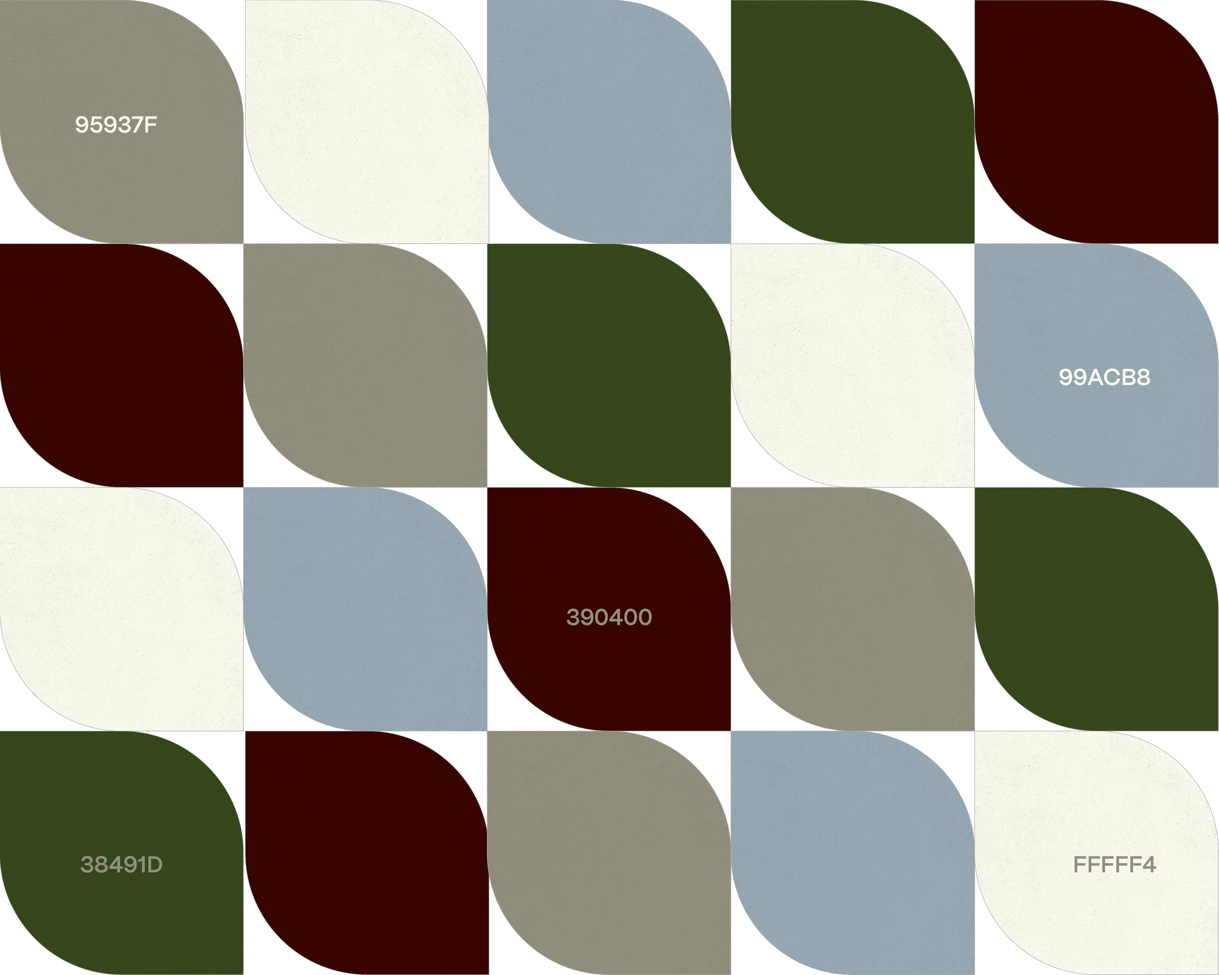
Fashion brands at Sylp's level tend to retreat into black and white minimalism. Sylp's entire point is that cultures and art forms can be blended in unexpected ways, and the palette needed to prove it. The system is built on four colours. A deep maroon, drawn from velvet, from bridal reds aged into something quieter, from the embroidery thread that runs through the collections. An olive green with the depth of mehendi and aged brass. A powder blue that belongs to no traditional Indian palette at all, cool and contemporary, the deliberate outsider. And a bone off-white that gives the louder colours room to breathe. Individually, each colour is familiar. Together, they are not. Maroon beside olive beside powder blue is an unconventional combination, and that is the rationale: the palette behaves the way the garments do, taking elements that were never supposed to sit together and making the pairing feel inevitable. It also gives the brand practical range. Maroon carries richness and occasion, olive carries craft and earth, powder blue carries air and modernity, and the system stays recognisable whichever colour leads.
Fashion brands at Sylp's level tend to retreat into black and white minimalism. Sylp's entire point is that cultures and art forms can be blended in unexpected ways, and the palette needed to prove it. The system is built on four colours. A deep maroon, drawn from velvet, from bridal reds aged into something quieter, from the embroidery thread that runs through the collections. An olive green with the depth of mehendi and aged brass. A powder blue that belongs to no traditional Indian palette at all, cool and contemporary, the deliberate outsider. And a bone off-white that gives the louder colours room to breathe. Individually, each colour is familiar. Together, they are not. Maroon beside olive beside powder blue is an unconventional combination, and that is the rationale: the palette behaves the way the garments do, taking elements that were never supposed to sit together and making the pairing feel inevitable. It also gives the brand practical range. Maroon carries richness and occasion, olive carries craft and earth, powder blue carries air and modernity, and the system stays recognisable whichever colour leads.
Fashion brands at Sylp's level tend to retreat into black and white minimalism. Sylp's entire point is that cultures and art forms can be blended in unexpected ways, and the palette needed to prove it. The system is built on four colours. A deep maroon, drawn from velvet, from bridal reds aged into something quieter, from the embroidery thread that runs through the collections. An olive green with the depth of mehendi and aged brass. A powder blue that belongs to no traditional Indian palette at all, cool and contemporary, the deliberate outsider. And a bone off-white that gives the louder colours room to breathe. Individually, each colour is familiar. Together, they are not. Maroon beside olive beside powder blue is an unconventional combination, and that is the rationale: the palette behaves the way the garments do, taking elements that were never supposed to sit together and making the pairing feel inevitable. It also gives the brand practical range. Maroon carries richness and occasion, olive carries craft and earth, powder blue carries air and modernity, and the system stays recognisable whichever colour leads.


The Typography
The Typography
The Typography
The first typographic decision was the wordmark. The mark's soft geometry needed a partner with structure and a hint of ceremony, so we set SYLP in Serif Medium, the typeface by Jurgen Geiger, generously letterspaced. It brings the cadence of couture and editorial fashion, and its sharp junctions answer the points of the star inside the mark. Its medium weight keeps it grounded: present enough to stand beside the symbol, quiet enough never to compete with it. For everything else the brand needs to say, we chose PP Mori from Pangram Pangram. Mori is a contemporary grotesque with a quiet geometric undertone, and it plays the counterpart role precisely. Where the serif wordmark carries tradition, Mori carries the present tense: campaign lines, lookbook copy, tags, business cards, and captions, most often set in spaced capitals that echo the wordmark's rhythm. The pairing is the brand's philosophy made typographic. A serif rooted in heritage and a grotesque rooted in modernity, working in one system without friction.
The first typographic decision was the wordmark. The mark's soft geometry needed a partner with structure and a hint of ceremony, so we set SYLP in Serif Medium, the typeface by Jurgen Geiger, generously letterspaced. It brings the cadence of couture and editorial fashion, and its sharp junctions answer the points of the star inside the mark. Its medium weight keeps it grounded: present enough to stand beside the symbol, quiet enough never to compete with it. For everything else the brand needs to say, we chose PP Mori from Pangram Pangram. Mori is a contemporary grotesque with a quiet geometric undertone, and it plays the counterpart role precisely. Where the serif wordmark carries tradition, Mori carries the present tense: campaign lines, lookbook copy, tags, business cards, and captions, most often set in spaced capitals that echo the wordmark's rhythm. The pairing is the brand's philosophy made typographic. A serif rooted in heritage and a grotesque rooted in modernity, working in one system without friction.
The first typographic decision was the wordmark. The mark's soft geometry needed a partner with structure and a hint of ceremony, so we set SYLP in Serif Medium, the typeface by Jurgen Geiger, generously letterspaced. It brings the cadence of couture and editorial fashion, and its sharp junctions answer the points of the star inside the mark. Its medium weight keeps it grounded: present enough to stand beside the symbol, quiet enough never to compete with it. For everything else the brand needs to say, we chose PP Mori from Pangram Pangram. Mori is a contemporary grotesque with a quiet geometric undertone, and it plays the counterpart role precisely. Where the serif wordmark carries tradition, Mori carries the present tense: campaign lines, lookbook copy, tags, business cards, and captions, most often set in spaced capitals that echo the wordmark's rhythm. The pairing is the brand's philosophy made typographic. A serif rooted in heritage and a grotesque rooted in modernity, working in one system without friction.


(03)
PROJECTS