" height="14.062500505751508px" id="uXHscogcx" transform="translate(0 15.5)" width="44.99999937402862px"/></svg>)
TG Polymers
TG Polymers
TG Polymers is a 28-year-old B2B industrial packaging manufacturer based in Muhamma, Alappuzah a, Kerala, India. The business serves over 1,000 clients globally across diverse industries including rubber, agriculture, food and spices, seafood, chemicals and fertilizers, and coir production. Operating with a daily production capacity of 30 tons and a 24-hour operational laboratory and factory, TG Polymers manufactures LDPE poly bags, perforated PP films, wrap films, stretch films, shrink films, shading nets, HDPE pipes, and multiwall paper bags. The family-owned company operates with strong Christian values and approached Studio Cherian with a brief that included biblical relevance while maintaining industrial credibility and B2B professionalism for their global client base.
TG Polymers is a 28-year-old B2B industrial packaging manufacturer based in Muhamma, Alappuzah a, Kerala, India. The business serves over 1,000 clients globally across diverse industries including rubber, agriculture, food and spices, seafood, chemicals and fertilizers, and coir production. Operating with a daily production capacity of 30 tons and a 24-hour operational laboratory and factory, TG Polymers manufactures LDPE poly bags, perforated PP films, wrap films, stretch films, shrink films, shading nets, HDPE pipes, and multiwall paper bags. The family-owned company operates with strong Christian values and approached Studio Cherian with a brief that included biblical relevance while maintaining industrial credibility and B2B professionalism for their global client base.
Year
2025
Industry
B2B Manufacturing
Space of work
Brand Identity Design
Timeline
4 weeks
The Challenge
The Challenge
The challenge was to create a visual identity that honored the founding family's Christian faith tradition without appearing overtly religious or alienating the technical B2B audience of procurement managers, factory operators, and industrial buyers. The identity needed to connect conceptually to the protection and preservation work that industrial packaging performs while working across diverse applications: fleet vehicles and container trucks, factory and warehouse signage, corporate profile materials, business cards and stationery, exhibition booth systems, and product packaging. The visual language had to resonate with both the founding family's values and the functional demands of clients ordering industrial-grade packaging solutions for rubber sheets, rice exports, seafood shipping, and chemical storage.
The challenge was to create a visual identity that honored the founding family's Christian faith tradition without appearing overtly religious or alienating the technical B2B audience of procurement managers, factory operators, and industrial buyers. The identity needed to connect conceptually to the protection and preservation work that industrial packaging performs while working across diverse applications: fleet vehicles and container trucks, factory and warehouse signage, corporate profile materials, business cards and stationery, exhibition booth systems, and product packaging. The visual language had to resonate with both the founding family's values and the functional demands of clients ordering industrial-grade packaging solutions for rubber sheets, rice exports, seafood shipping, and chemical storage.


The Concept
The Concept
The Concept
Concept B drew from the story of Noah's Ark. The symbolism was structurally and conceptually sound: the ark was built to preserve life through protection and waterproofing during the flood. Industrial packaging performs the exact same function for products in transit and storage, protecting contents from moisture, contamination, and damage. The connection between biblical preservation and industrial protection formed the conceptual foundation of the entire identity system.
Concept B drew from the story of Noah's Ark. The symbolism was structurally and conceptually sound: the ark was built to preserve life through protection and waterproofing during the flood. Industrial packaging performs the exact same function for products in transit and storage, protecting contents from moisture, contamination, and damage. The connection between biblical preservation and industrial protection formed the conceptual foundation of the entire identity system.
Concept B drew from the story of Noah's Ark. The symbolism was structurally and conceptually sound: the ark was built to preserve life through protection and waterproofing during the flood. Industrial packaging performs the exact same function for products in transit and storage, protecting contents from moisture, contamination, and damage. The connection between biblical preservation and industrial protection formed the conceptual foundation of the entire identity system.


The Logo Mark
The Logo Mark
The Logo Mark
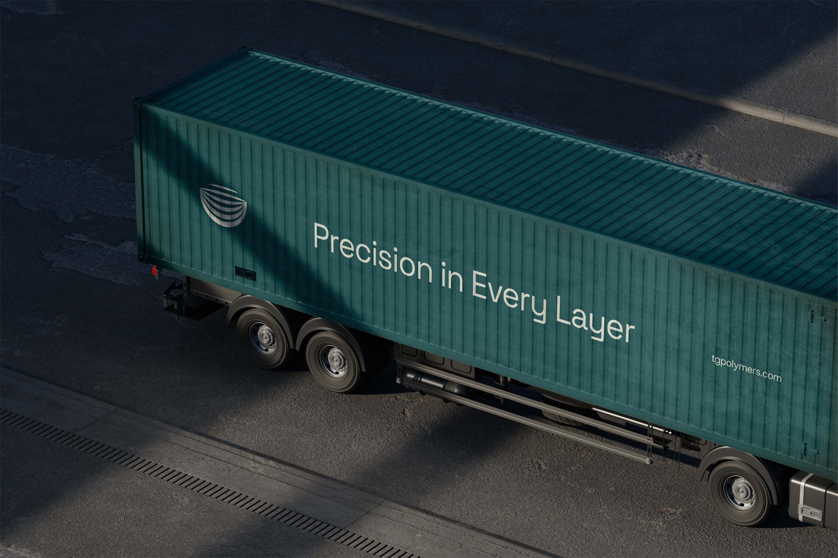
We built the logo as an abstract ark constructed from stacked curved horizontal bands forming a vessel or bowl shape. The layered structure references the multiple decks and levels of the ark while reading as a clean, modern, geometric industrial mark. No animals. No literal boat imagery. No Sunday school aesthetics. Just the geometric essence of containment, protection, and preservation. The mark performs equally well on small packaging tags and large-scale container truck applications without losing clarity, meaning, or visual impact. The form signals craft authenticity and heritage through the ark reference while feeling contemporary and refined through its geometric simplification and modern execution.
We built the logo as an abstract ark constructed from stacked curved horizontal bands forming a vessel or bowl shape. The layered structure references the multiple decks and levels of the ark while reading as a clean, modern, geometric industrial mark. No animals. No literal boat imagery. No Sunday school aesthetics. Just the geometric essence of containment, protection, and preservation. The mark performs equally well on small packaging tags and large-scale container truck applications without losing clarity, meaning, or visual impact. The form signals craft authenticity and heritage through the ark reference while feeling contemporary and refined through its geometric simplification and modern execution.
We built the logo as an abstract ark constructed from stacked curved horizontal bands forming a vessel or bowl shape. The layered structure references the multiple decks and levels of the ark while reading as a clean, modern, geometric industrial mark. No animals. No literal boat imagery. No Sunday school aesthetics. Just the geometric essence of containment, protection, and preservation. The mark performs equally well on small packaging tags and large-scale container truck applications without losing clarity, meaning, or visual impact. The form signals craft authenticity and heritage through the ark reference while feeling contemporary and refined through its geometric simplification and modern execution.


The Visual Pattern System
The Visual Pattern System
The Visual Pattern System
The radiating curved lines emanate from the logo mark like rays of light or waves expanding outward. The pattern represents hope, divine promise, and the rainbow covenant that followed the flood in the biblical narrative. Abstracted into clean geometric lines, the pattern works at every scale from business card backgrounds to 40-foot container truck wraps. The system creates visual consistency and brand recognition while remaining flexible enough to work across TG Polymers' diverse range of industrial packaging products and applications.
The radiating curved lines emanate from the logo mark like rays of light or waves expanding outward. The pattern represents hope, divine promise, and the rainbow covenant that followed the flood in the biblical narrative. Abstracted into clean geometric lines, the pattern works at every scale from business card backgrounds to 40-foot container truck wraps. The system creates visual consistency and brand recognition while remaining flexible enough to work across TG Polymers' diverse range of industrial packaging products and applications.
The radiating curved lines emanate from the logo mark like rays of light or waves expanding outward. The pattern represents hope, divine promise, and the rainbow covenant that followed the flood in the biblical narrative. Abstracted into clean geometric lines, the pattern works at every scale from business card backgrounds to 40-foot container truck wraps. The system creates visual consistency and brand recognition while remaining flexible enough to work across TG Polymers' diverse range of industrial packaging products and applications.


The Color Palette and Typography
The Color Palette and Typography
The Color Palette and Typography
Deep Teal Blue functions as the primary brand color, connecting naturally to industrial plastics and packaging while maintaining premium credibility. Vivid Mint Green serves as the accent color for the radiating pattern system and highlights. Lime Ice provides a softer highlight option. Soft Mist White functions as the neutral base. The palette avoids predictable industrial grays and blues while remaining appropriate for B2B technical contexts. Typography uses Host Grotesk, a clean, geometric, industrial sans-serif typeface that reinforces the B2B manufacturing context and allows the conceptual ark symbolism to carry the narrative weight without typographic ornamentation.
Deep Teal Blue functions as the primary brand color, connecting naturally to industrial plastics and packaging while maintaining premium credibility. Vivid Mint Green serves as the accent color for the radiating pattern system and highlights. Lime Ice provides a softer highlight option. Soft Mist White functions as the neutral base. The palette avoids predictable industrial grays and blues while remaining appropriate for B2B technical contexts. Typography uses Host Grotesk, a clean, geometric, industrial sans-serif typeface that reinforces the B2B manufacturing context and allows the conceptual ark symbolism to carry the narrative weight without typographic ornamentation.
Deep Teal Blue functions as the primary brand color, connecting naturally to industrial plastics and packaging while maintaining premium credibility. Vivid Mint Green serves as the accent color for the radiating pattern system and highlights. Lime Ice provides a softer highlight option. Soft Mist White functions as the neutral base. The palette avoids predictable industrial grays and blues while remaining appropriate for B2B technical contexts. Typography uses Host Grotesk, a clean, geometric, industrial sans-serif typeface that reinforces the B2B manufacturing context and allows the conceptual ark symbolism to carry the narrative weight without typographic ornamentation.


The Outcome
The Outcome
The Outcome
Internal discussions revealed the implementation challenge. TG Polymers had been operating for 28 years with existing signage systems, vehicle wraps, and branded touchpoints across three production facilities. Replacing this infrastructure with Concept B required capital investment the business could not justify during the current fiscal period. The brand identity needed to be retrofit-compatible with existing systems to minimize implementation costs. Concept B required a complete rebrand across every touchpoint. The client chose Option A instead, a conservative rework of their existing logo that could be applied to current signage and vehicle wraps without full replacement. Concept B was archived as a case study in how biblical symbolism can be abstracted into sophisticated modern industrial brand language without sacrificing conceptual integrity or visual sophistication, even when implementation realities prevent the work from going live.
Internal discussions revealed the implementation challenge. TG Polymers had been operating for 28 years with existing signage systems, vehicle wraps, and branded touchpoints across three production facilities. Replacing this infrastructure with Concept B required capital investment the business could not justify during the current fiscal period. The brand identity needed to be retrofit-compatible with existing systems to minimize implementation costs. Concept B required a complete rebrand across every touchpoint. The client chose Option A instead, a conservative rework of their existing logo that could be applied to current signage and vehicle wraps without full replacement. Concept B was archived as a case study in how biblical symbolism can be abstracted into sophisticated modern industrial brand language without sacrificing conceptual integrity or visual sophistication, even when implementation realities prevent the work from going live.
Internal discussions revealed the implementation challenge. TG Polymers had been operating for 28 years with existing signage systems, vehicle wraps, and branded touchpoints across three production facilities. Replacing this infrastructure with Concept B required capital investment the business could not justify during the current fiscal period. The brand identity needed to be retrofit-compatible with existing systems to minimize implementation costs. Concept B required a complete rebrand across every touchpoint. The client chose Option A instead, a conservative rework of their existing logo that could be applied to current signage and vehicle wraps without full replacement. Concept B was archived as a case study in how biblical symbolism can be abstracted into sophisticated modern industrial brand language without sacrificing conceptual integrity or visual sophistication, even when implementation realities prevent the work from going live.


(03)
PROJECTS