" height="14.062500505751508px" id="uXHscogcx" transform="translate(0 15.5)" width="44.99999937402862px"/></svg>)
KENNITH
KENNITH
Kennith Infraventures operates as the franchise owner of one of India's leading interior brands, with offices across Kochi, Thrissur, and Kottayam. But the business is led by three construction managers trained at NICMAR Pune, and their ambition extended beyond franchise operations. They wanted to establish themselves as an independent design and development firm, starting with interiors. The structural expertise was there. The brand was not.
Kennith Infraventures operates as the franchise owner of one of India's leading interior brands, with offices across Kochi, Thrissur, and Kottayam. But the business is led by three construction managers trained at NICMAR Pune, and their ambition extended beyond franchise operations. They wanted to establish themselves as an independent design and development firm, starting with interiors. The structural expertise was there. The brand was not.
Year
2025
Industry
Architecture & Interiors
Space of work
Brand Identity & Website Design
Timeline
8 Weeks
The Challenge
The Challenge
Kennith had operated under someone else's identity for years. They had no logo, no visual system, just a company name on a letterhead. The market knew them only as franchise operators. To move forward as an independent firm, they needed an identity that communicated what made them different: construction managers who understand homes at a structural level, not just surface designers arranging furniture. The identity needed to work across physical and digital touchpoints, from building facades to website favicons, while holding the concept of elegance and strength.
Kennith had operated under someone else's identity for years. They had no logo, no visual system, just a company name on a letterhead. The market knew them only as franchise operators. To move forward as an independent firm, they needed an identity that communicated what made them different: construction managers who understand homes at a structural level, not just surface designers arranging furniture. The identity needed to work across physical and digital touchpoints, from building facades to website favicons, while holding the concept of elegance and strength.


The Mark
The Mark
The Mark
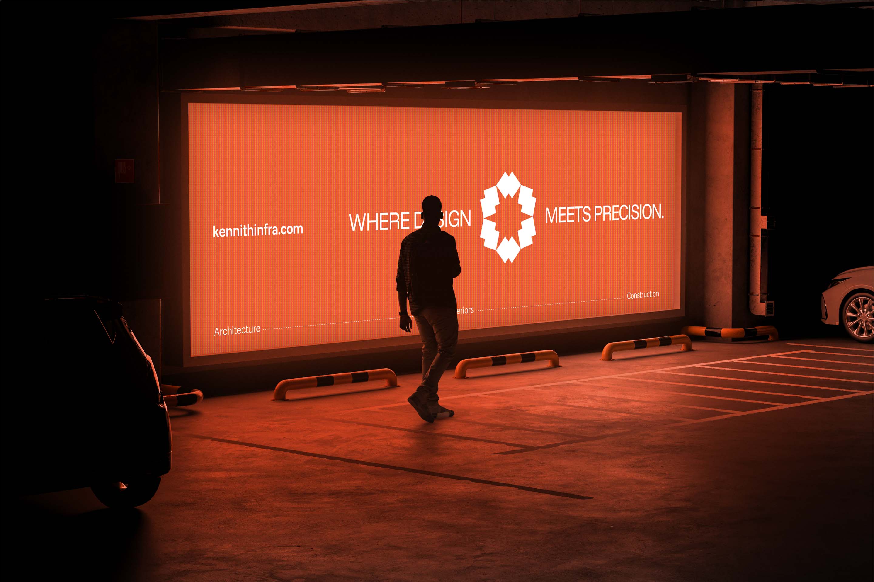
The logomark is a radial geometric form created through repetition of a single graphical element inspired by a generic floor plan outline. We tested different variations with different numbers of instances repeating radially and settled on one that works well across platforms. The radial structure conveys elegance. The floor plan reference signals structural clarity. The mark performs exceptionally well at large scale applications like facade signage and building exteriors because the geometry is clean and easily perceived from distance. At small scales like favicons and app icons, it remains legible and conveys the message of strength and elegance without losing detail.
The logomark is a radial geometric form created through repetition of a single graphical element inspired by a generic floor plan outline. We tested different variations with different numbers of instances repeating radially and settled on one that works well across platforms. The radial structure conveys elegance. The floor plan reference signals structural clarity. The mark performs exceptionally well at large scale applications like facade signage and building exteriors because the geometry is clean and easily perceived from distance. At small scales like favicons and app icons, it remains legible and conveys the message of strength and elegance without losing detail.
The logomark is a radial geometric form created through repetition of a single graphical element inspired by a generic floor plan outline. We tested different variations with different numbers of instances repeating radially and settled on one that works well across platforms. The radial structure conveys elegance. The floor plan reference signals structural clarity. The mark performs exceptionally well at large scale applications like facade signage and building exteriors because the geometry is clean and easily perceived from distance. At small scales like favicons and app icons, it remains legible and conveys the message of strength and elegance without losing detail.


The Typography
The Typography
The Typography
We selected Funnel Display in uppercase for titles and Funnel Sans in sentence case for body copy and subheadings. The typeface choice wasn't arbitrary. Funnel carries elegance in its proportions but reveals structural rigidity in certain glyphs. It mirrors the brand positioning: refined visual language built on construction-grade thinking.
We selected Funnel Display in uppercase for titles and Funnel Sans in sentence case for body copy and subheadings. The typeface choice wasn't arbitrary. Funnel carries elegance in its proportions but reveals structural rigidity in certain glyphs. It mirrors the brand positioning: refined visual language built on construction-grade thinking.
We selected Funnel Display in uppercase for titles and Funnel Sans in sentence case for body copy and subheadings. The typeface choice wasn't arbitrary. Funnel carries elegance in its proportions but reveals structural rigidity in certain glyphs. It mirrors the brand positioning: refined visual language built on construction-grade thinking.


The System
The System
The System
Beyond the logo and website, we built exhibition backdrops, a corporate profile, and complete stationery systems. Kennith also signed a retainer with us to design, shoot, and edit content for their social media. The identity needed to function as a complete ecosystem, not just a logo and colour palette. Every application reinforces the same positioning: designers who think like builders.
Beyond the logo and website, we built exhibition backdrops, a corporate profile, and complete stationery systems. Kennith also signed a retainer with us to design, shoot, and edit content for their social media. The identity needed to function as a complete ecosystem, not just a logo and colour palette. Every application reinforces the same positioning: designers who think like builders.
Beyond the logo and website, we built exhibition backdrops, a corporate profile, and complete stationery systems. Kennith also signed a retainer with us to design, shoot, and edit content for their social media. The identity needed to function as a complete ecosystem, not just a logo and colour palette. Every application reinforces the same positioning: designers who think like builders.


(03)
PROJECTS