" height="14.062500505751508px" id="uXHscogcx" transform="translate(0 15.5)" width="44.99999937402862px"/></svg>)
PAASHÈ
PAASHÈ
PAASHÈ is a handmade rug brand based in Rajasthan, India. The name comes from Sanskrit, meaning something that holds things together: tied, interlaced, and bound as one. Founded by former employees of a prominent rug brand in India, PAASHÈ positioned itself at the premium end of the market with abstract, contemporary designs. The founders brought deep craft knowledge but needed an identity that matched their ambition.
PAASHÈ is a handmade rug brand based in Rajasthan, India. The name comes from Sanskrit, meaning something that holds things together: tied, interlaced, and bound as one. Founded by former employees of a prominent rug brand in India, PAASHÈ positioned itself at the premium end of the market with abstract, contemporary designs. The founders brought deep craft knowledge but needed an identity that matched their ambition.
Year
2026
Industry
Home & Lifestyle
Space of work
Visual Identity Design
Timeline
8 weeks

The Challenge
The Challenge
PAASHÈ is a handmade rug brand based in Rajasthan, India. The name comes from Sanskrit, meaning something that holds things together: tied, interlaced, and bound as one. Founded by former employees of a prominent rug brand in India, PAASHÈ positioned itself at the premium end of the market with abstract, contemporary designs. The founders brought deep craft knowledge but needed an identity that matched their ambition.
PAASHÈ is a handmade rug brand based in Rajasthan, India. The name comes from Sanskrit, meaning something that holds things together: tied, interlaced, and bound as one. Founded by former employees of a prominent rug brand in India, PAASHÈ positioned itself at the premium end of the market with abstract, contemporary designs. The founders brought deep craft knowledge but needed an identity that matched their ambition.

The Mark
The Mark
The Mark
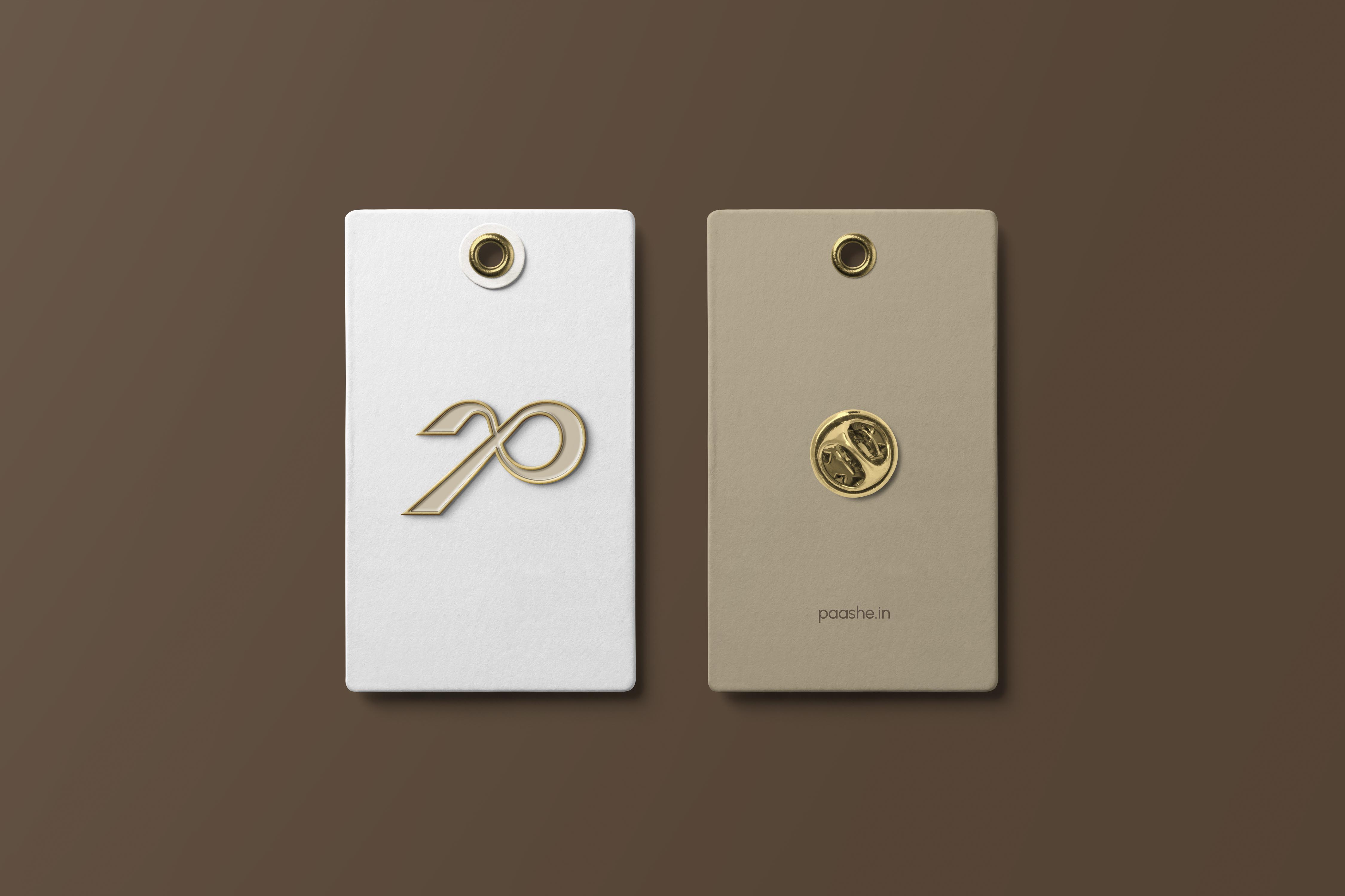
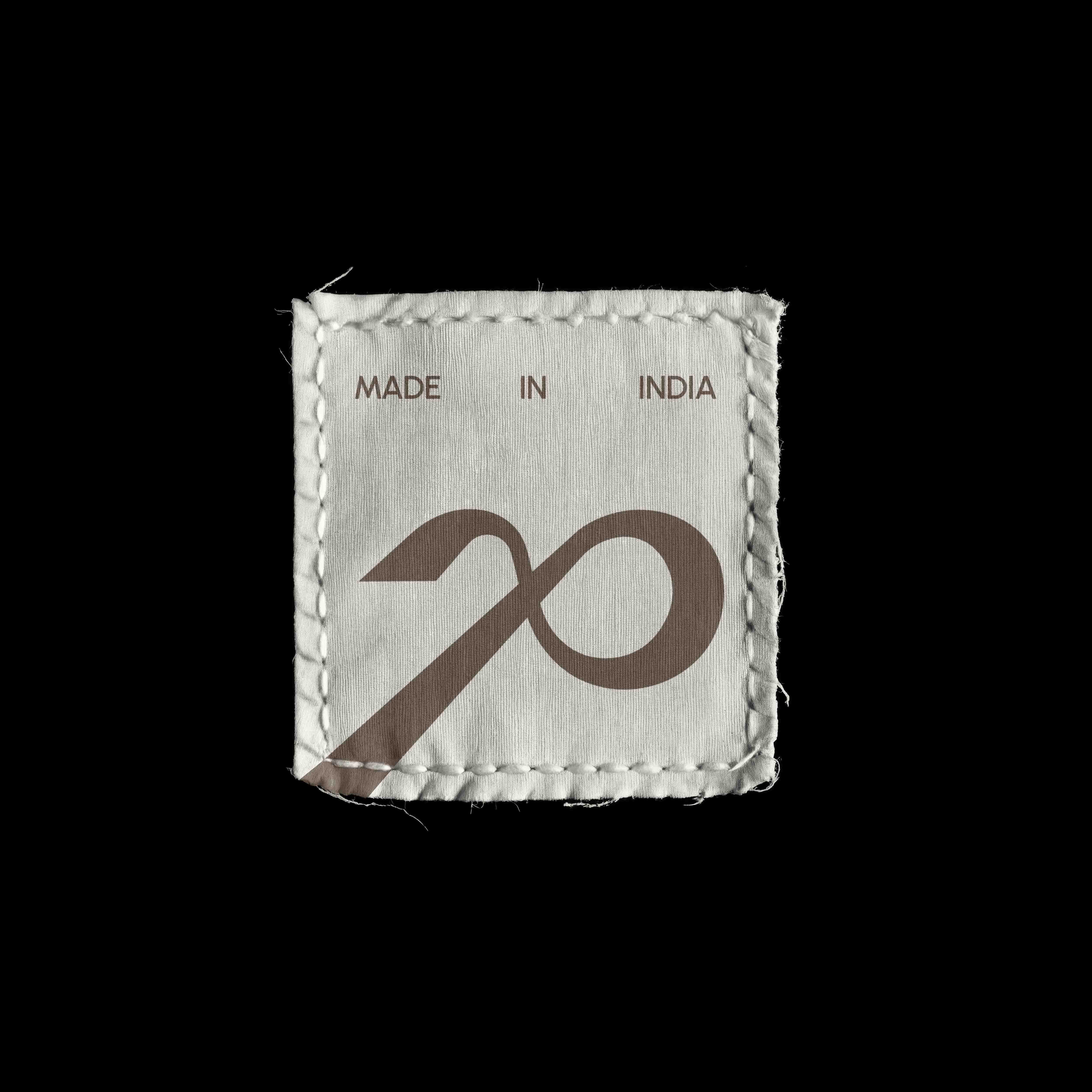
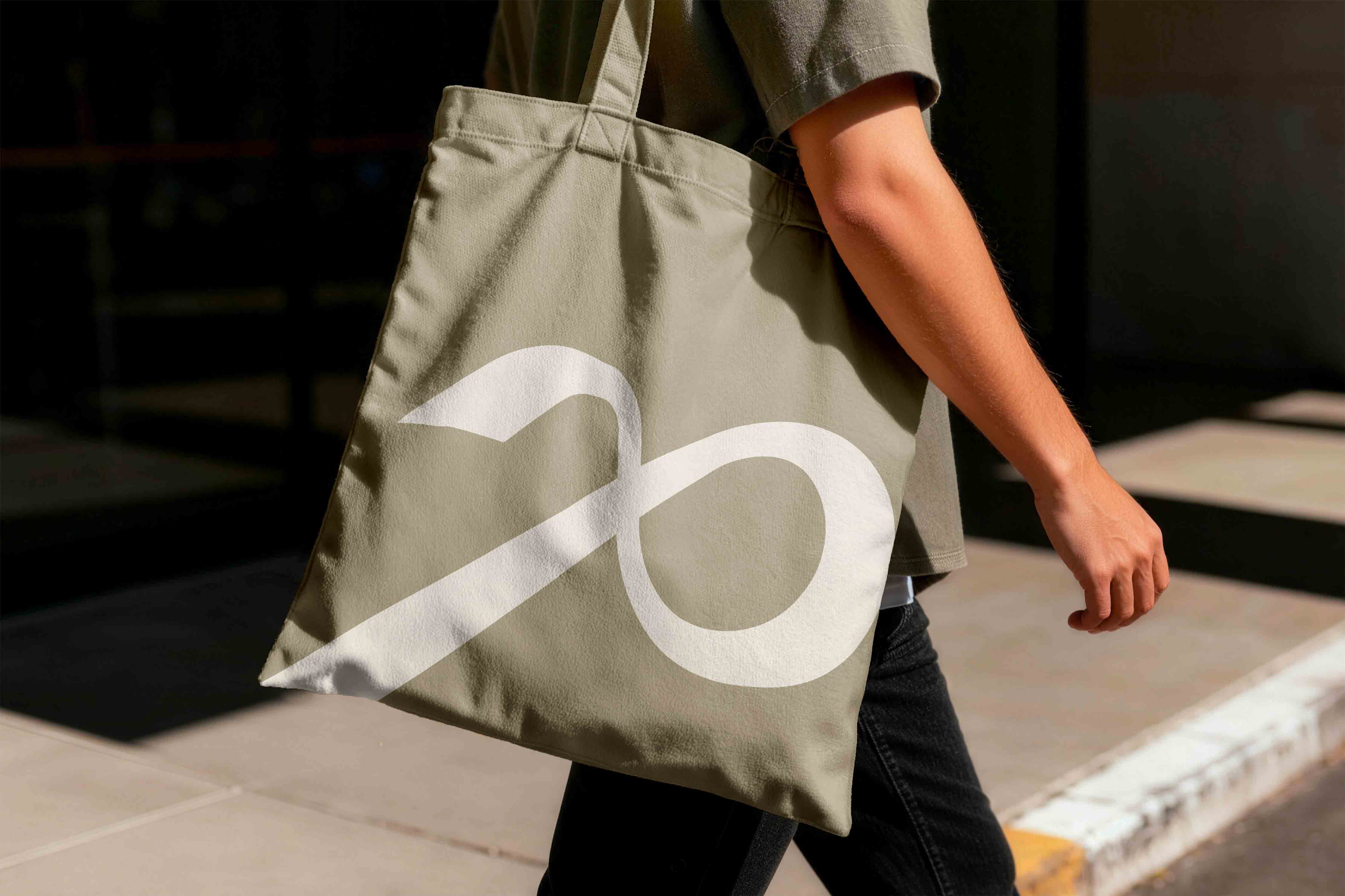
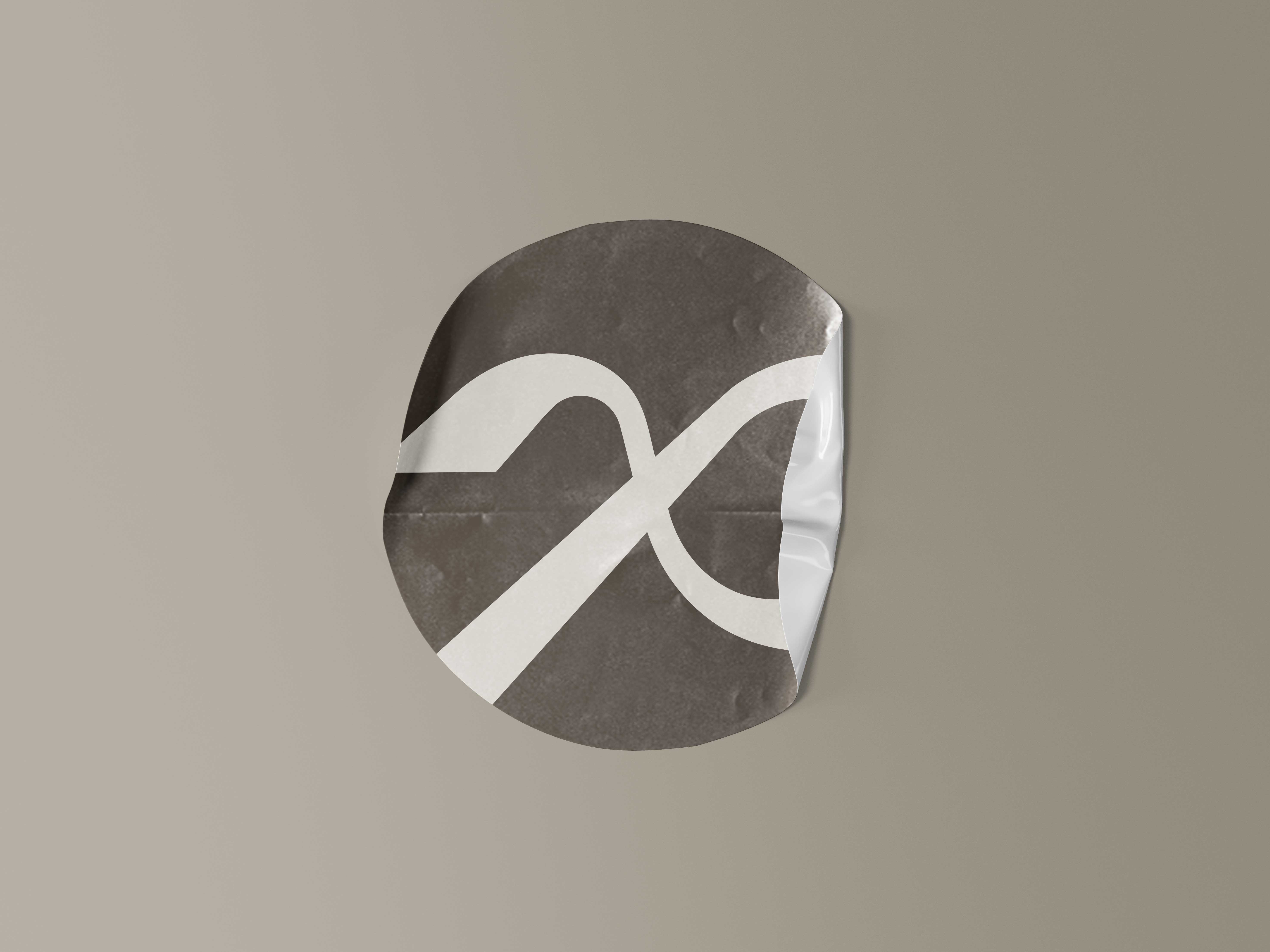
The logomark is a stylized P inspired by the structure of the Persian knot, the foundational technique in handmade rug weaving. The form is enclosed in a square container, mirroring the way a rug sits within its defined frame. The mark does two things at once: it signals craft authenticity through the knot reference, and it feels contemporary through its geometric simplification. It performs equally well on small packaging tags and large-scale digital applications without losing clarity or meaning.
The logomark is a stylized P inspired by the structure of the Persian knot, the foundational technique in handmade rug weaving. The form is enclosed in a square container, mirroring the way a rug sits within its defined frame. The mark does two things at once: it signals craft authenticity through the knot reference, and it feels contemporary through its geometric simplification. It performs equally well on small packaging tags and large-scale digital applications without losing clarity or meaning.
The logomark is a stylized P inspired by the structure of the Persian knot, the foundational technique in handmade rug weaving. The form is enclosed in a square container, mirroring the way a rug sits within its defined frame. The mark does two things at once: it signals craft authenticity through the knot reference, and it feels contemporary through its geometric simplification. It performs equally well on small packaging tags and large-scale digital applications without losing clarity or meaning.


The Typography
The Typography
The Typography
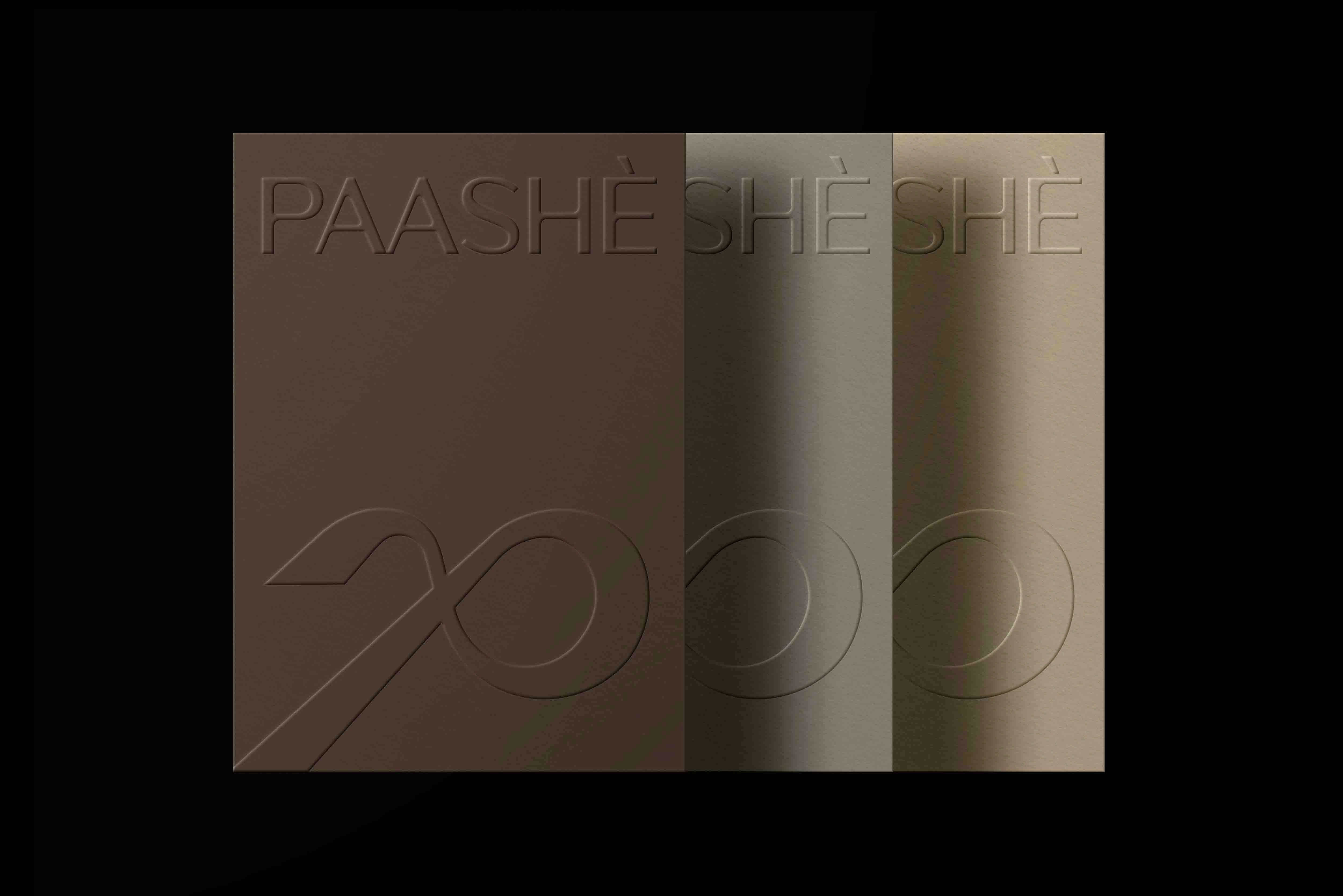
We initially explored TT Quaris for the logotype but moved to Mocha after testing it against the logomark. Mocha resonates with the structure of the mark itself: not too sharp, not the cliche serif used to signal luxury. It carries refinement without stiffness. For headings and body copy, we selected Urbanist. The typeface has a clean geometric structure that holds up well against abstract and texture-rich rug backgrounds without competing for attention.
We initially explored TT Quaris for the logotype but moved to Mocha after testing it against the logomark. Mocha resonates with the structure of the mark itself: not too sharp, not the cliche serif used to signal luxury. It carries refinement without stiffness. For headings and body copy, we selected Urbanist. The typeface has a clean geometric structure that holds up well against abstract and texture-rich rug backgrounds without competing for attention.
We initially explored TT Quaris for the logotype but moved to Mocha after testing it against the logomark. Mocha resonates with the structure of the mark itself: not too sharp, not the cliche serif used to signal luxury. It carries refinement without stiffness. For headings and body copy, we selected Urbanist. The typeface has a clean geometric structure that holds up well against abstract and texture-rich rug backgrounds without competing for attention.


The System
The System
The System
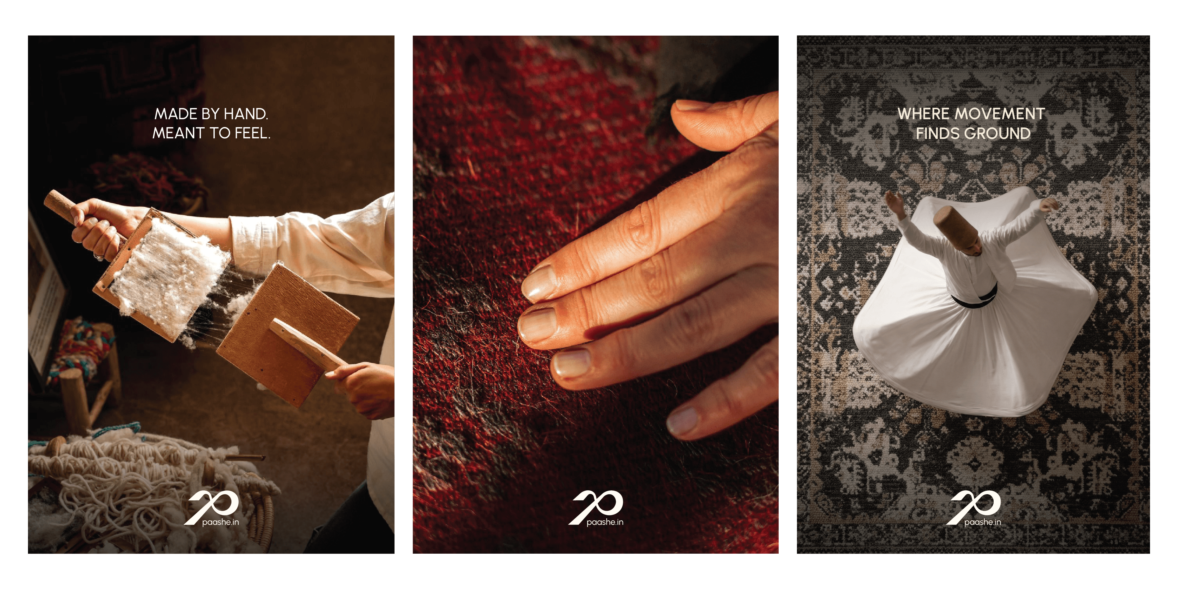
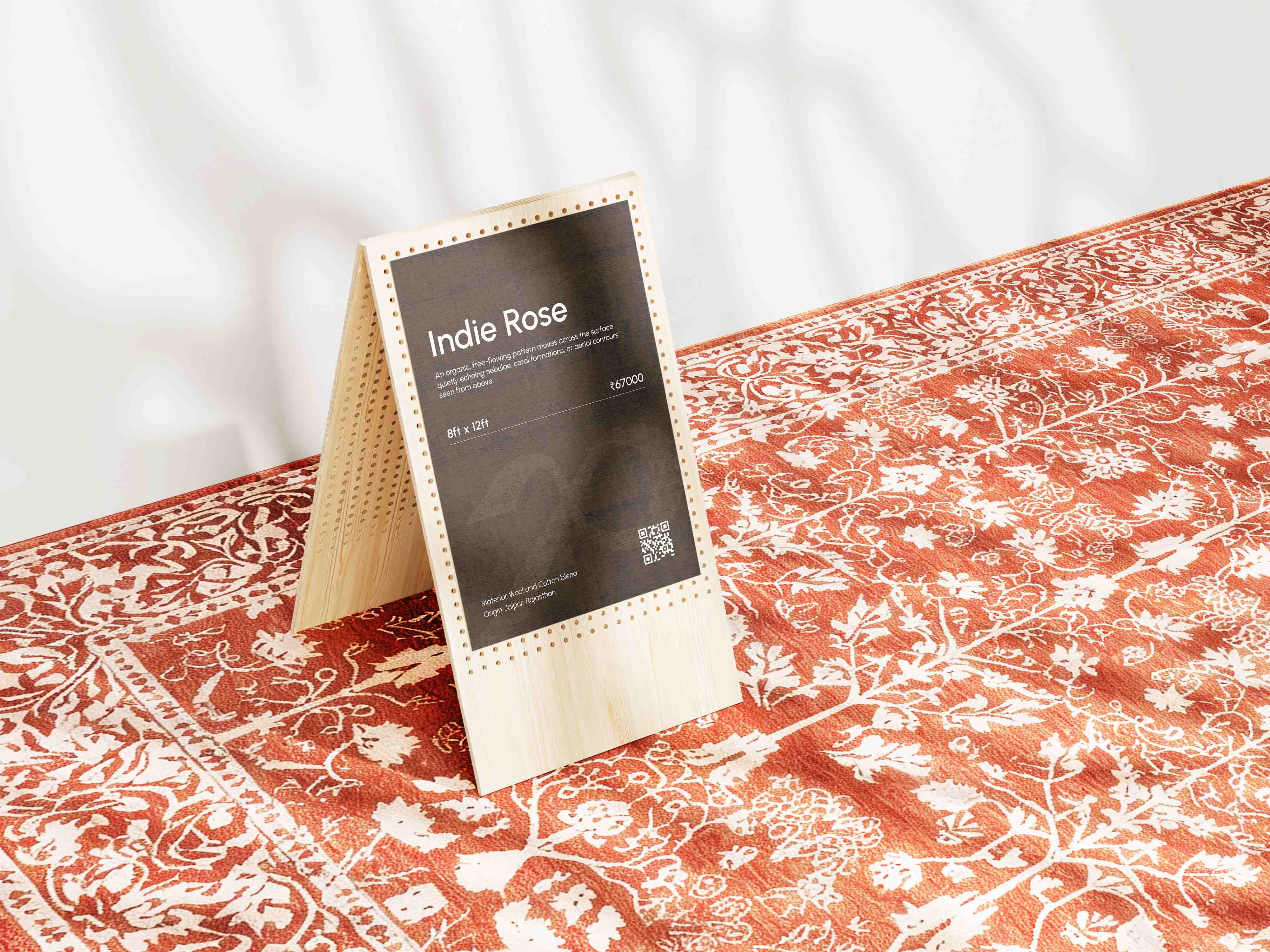
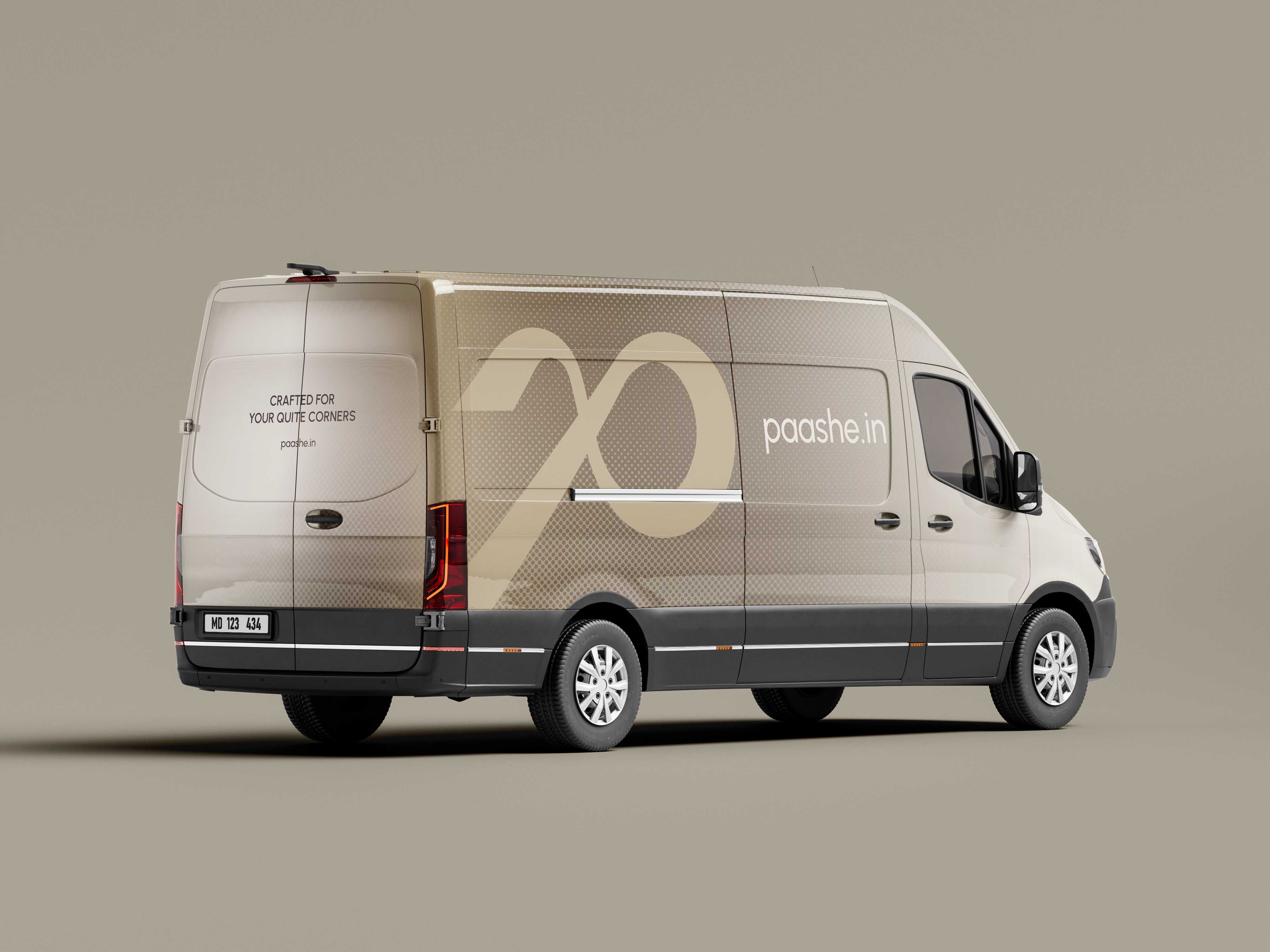
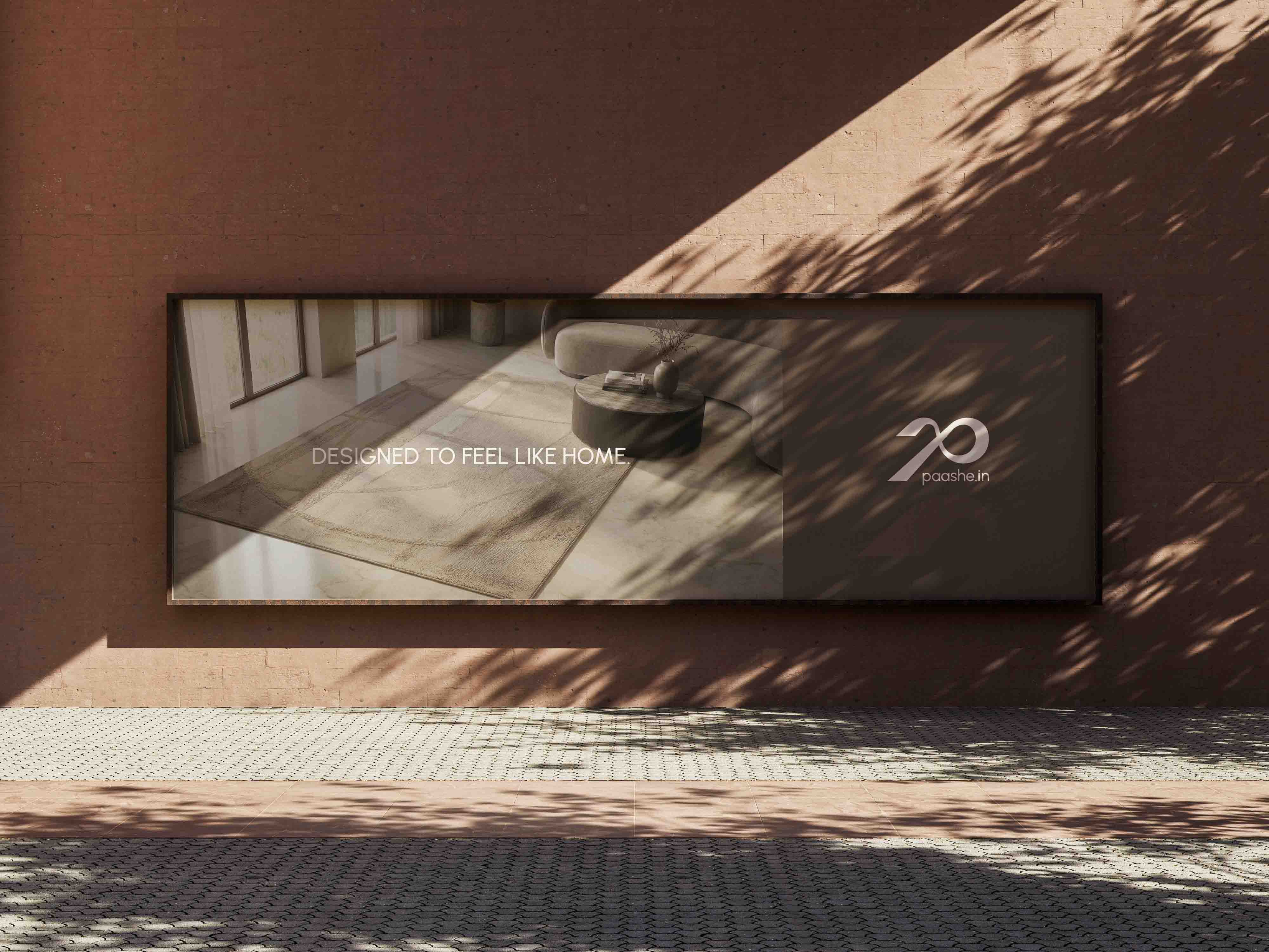
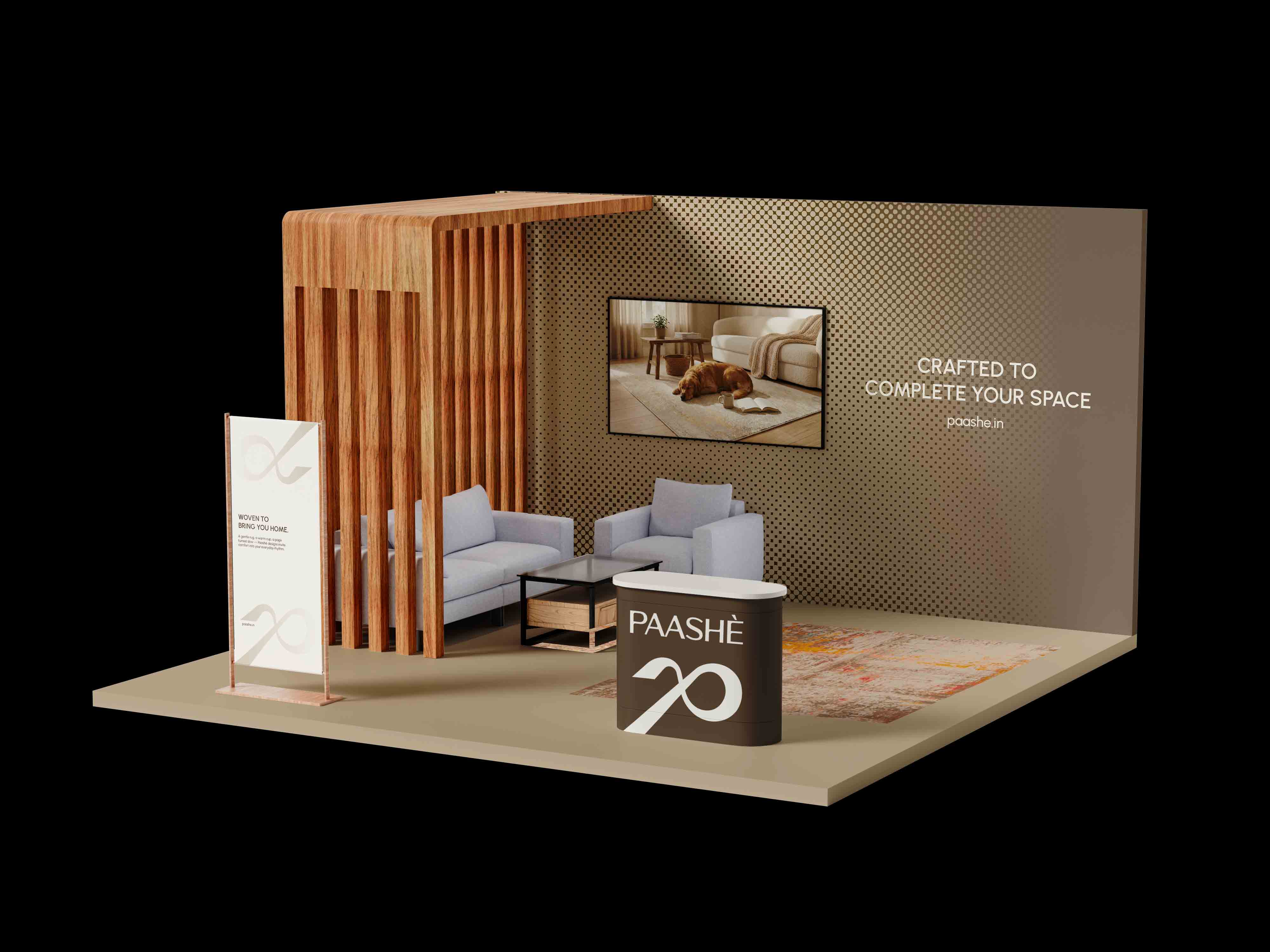
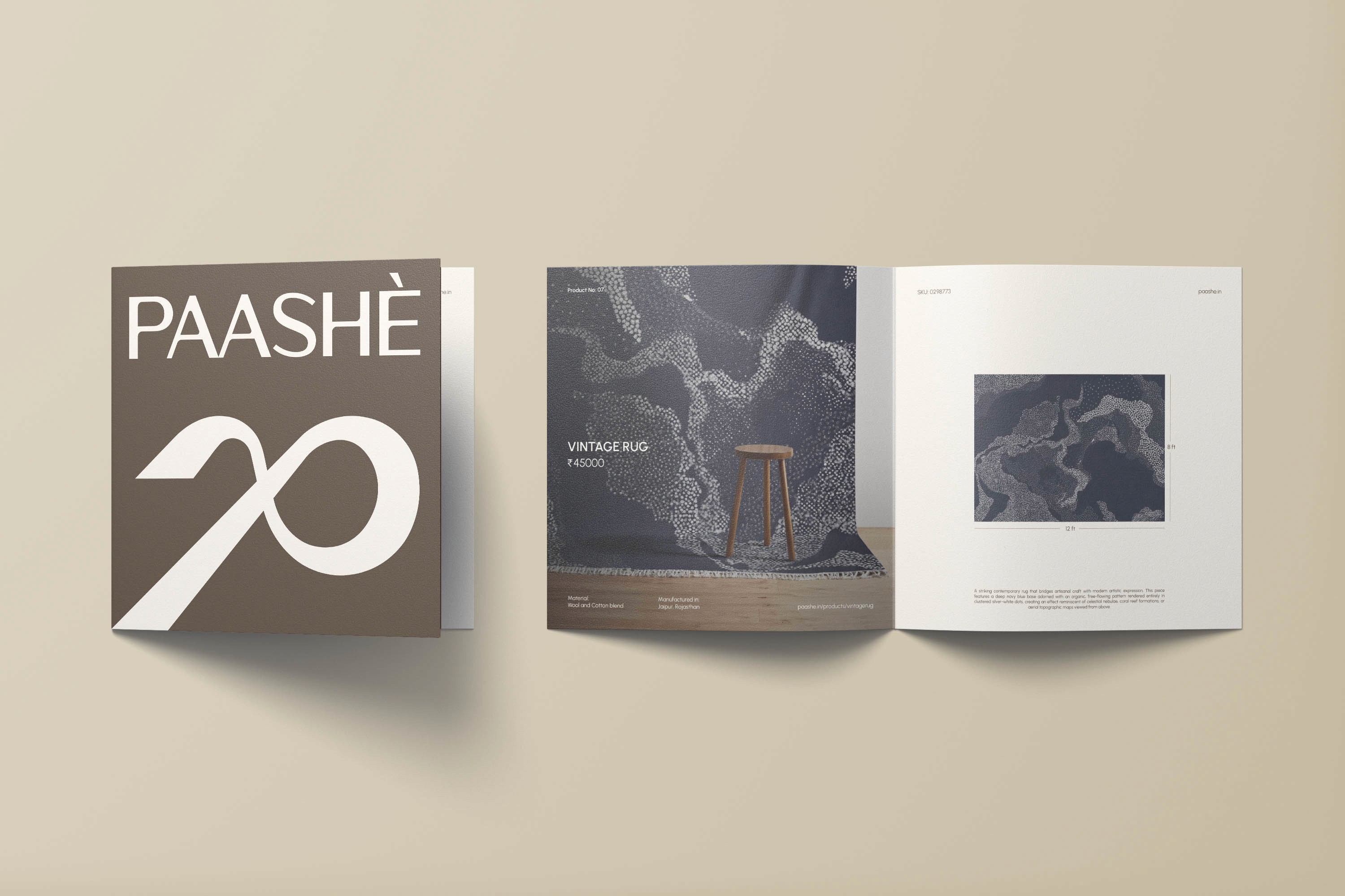
Beyond the logo and website, we built stationery items, packaging tags for each rug, and social media templates that could flex across PAASHÈ's range of abstract designs. The identity system had to support products that do not look alike, so we designed for visual consistency through typography and layout structure rather than rigid colour rules. Every touchpoint reinforces the same positioning: rugs that honour tradition but refuse to be defined by it.
Beyond the logo and website, we built stationery items, packaging tags for each rug, and social media templates that could flex across PAASHÈ's range of abstract designs. The identity system had to support products that do not look alike, so we designed for visual consistency through typography and layout structure rather than rigid colour rules. Every touchpoint reinforces the same positioning: rugs that honour tradition but refuse to be defined by it.
Beyond the logo and website, we built stationery items, packaging tags for each rug, and social media templates that could flex across PAASHÈ's range of abstract designs. The identity system had to support products that do not look alike, so we designed for visual consistency through typography and layout structure rather than rigid colour rules. Every touchpoint reinforces the same positioning: rugs that honour tradition but refuse to be defined by it.


(03)
PROJECTS