" height="14.062500505751508px" id="uXHscogcx" transform="translate(0 15.5)" width="44.99999937402862px"/></svg>)
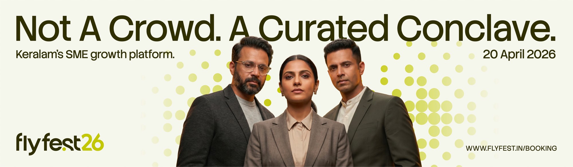
Flyfest 2026
Flyfest 2026
Tzvao Group is a Kerala-based economic systems consultancy with a particular ambition for the SME landscape it operates in. In 2025, Tzvao set out to launch Flyfest 2026, a curated business conclave positioned as Kerala's structured gateway to equity capital for growth-ready SMEs. The premise was a quietly radical one. A state with one of India's most active small-business cultures lacked a serious, well-architected meeting ground between growth-stage SMEs and the capital, strategy and scaling intelligence they needed to move forward. Flyfest was built to be that meeting ground.
Tzvao Group is a Kerala-based economic systems consultancy with a particular ambition for the SME landscape it operates in. In 2025, Tzvao set out to launch Flyfest 2026, a curated business conclave positioned as Kerala's structured gateway to equity capital for growth-ready SMEs. The premise was a quietly radical one. A state with one of India's most active small-business cultures lacked a serious, well-architected meeting ground between growth-stage SMEs and the capital, strategy and scaling intelligence they needed to move forward. Flyfest was built to be that meeting ground.
Year
2026
Industry
Event
Space of work
Visual Identity Design
Timeline
6 weeks


The Challenge
The Challenge
The Challenge
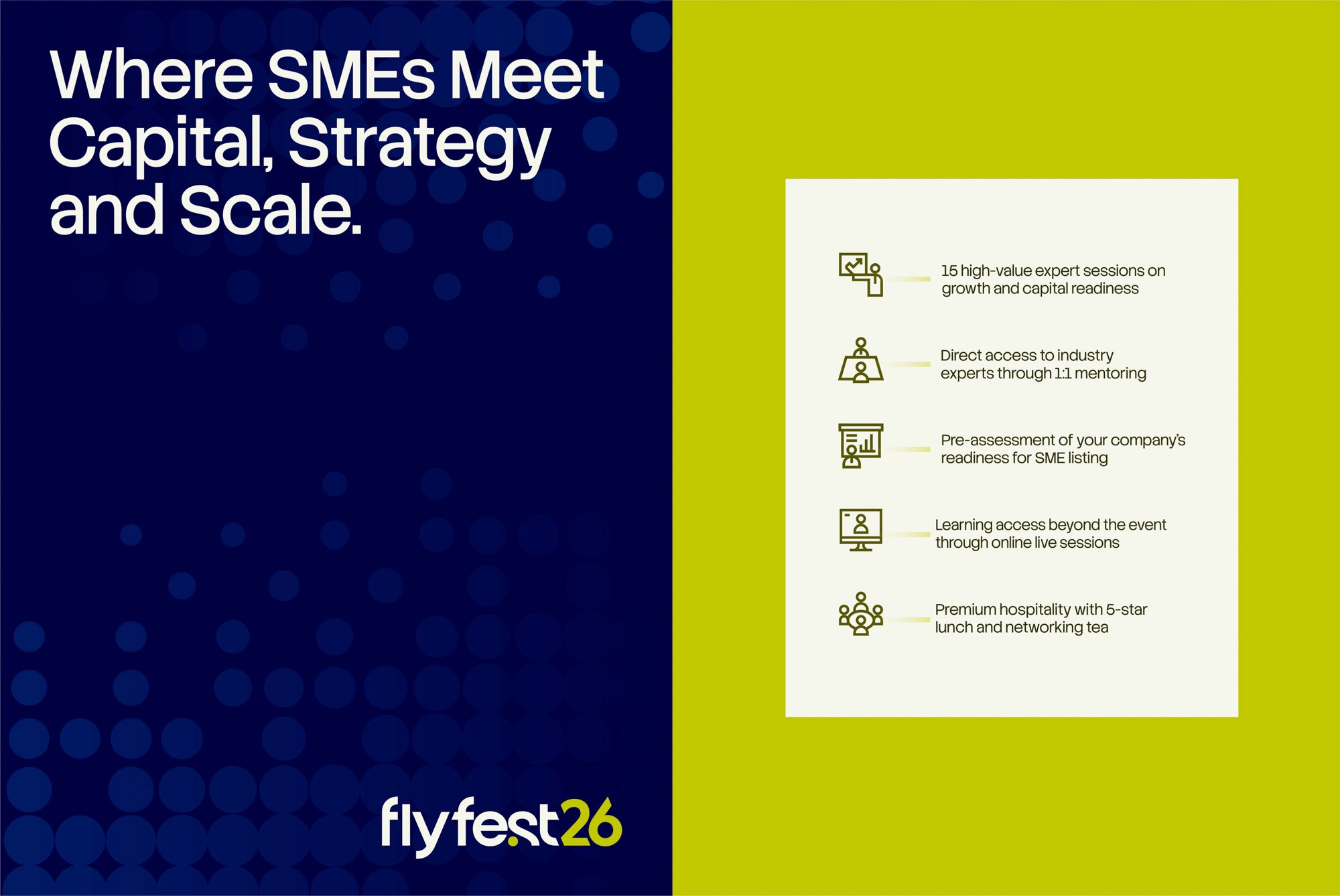
The strategic problem was sharper than it first appeared. Flyfest's audience was not a passive crowd of conference-goers. It was a specific group of growth-ready SME founders, the kind of people who had built a serious business through years of unglamorous discipline and were now contemplating the move from organic growth to structured equity capital. For most of them, this was an unfamiliar room. The language of equity, valuation, due diligence and structured investment was not the language they had built their businesses in. That created a design challenge with two opposing forces inside it. The identity had to feel serious enough to earn the trust of capital, and to signal real intellectual gravity, because no growth-stage founder is going to bet a meaningful part of their business journey on an event that looks like a generic networking meetup. At the same time, the identity could not be so corporate, so finance-coded, that it intimidated the very audience it was trying to gather. If the visual language read as boardroom, as Wall Street, as private equity in a tie, the audience would assume the room was not theirs. The work had to hold two emotional registers at once. Disciplined and approachable. Capital-grade and human. Premium without becoming exclusionary. Everything that followed was an exercise in calibrating that balance with precision.
The strategic problem was sharper than it first appeared. Flyfest's audience was not a passive crowd of conference-goers. It was a specific group of growth-ready SME founders, the kind of people who had built a serious business through years of unglamorous discipline and were now contemplating the move from organic growth to structured equity capital. For most of them, this was an unfamiliar room. The language of equity, valuation, due diligence and structured investment was not the language they had built their businesses in. That created a design challenge with two opposing forces inside it. The identity had to feel serious enough to earn the trust of capital, and to signal real intellectual gravity, because no growth-stage founder is going to bet a meaningful part of their business journey on an event that looks like a generic networking meetup. At the same time, the identity could not be so corporate, so finance-coded, that it intimidated the very audience it was trying to gather. If the visual language read as boardroom, as Wall Street, as private equity in a tie, the audience would assume the room was not theirs. The work had to hold two emotional registers at once. Disciplined and approachable. Capital-grade and human. Premium without becoming exclusionary. Everything that followed was an exercise in calibrating that balance with precision.
The strategic problem was sharper than it first appeared. Flyfest's audience was not a passive crowd of conference-goers. It was a specific group of growth-ready SME founders, the kind of people who had built a serious business through years of unglamorous discipline and were now contemplating the move from organic growth to structured equity capital. For most of them, this was an unfamiliar room. The language of equity, valuation, due diligence and structured investment was not the language they had built their businesses in. That created a design challenge with two opposing forces inside it. The identity had to feel serious enough to earn the trust of capital, and to signal real intellectual gravity, because no growth-stage founder is going to bet a meaningful part of their business journey on an event that looks like a generic networking meetup. At the same time, the identity could not be so corporate, so finance-coded, that it intimidated the very audience it was trying to gather. If the visual language read as boardroom, as Wall Street, as private equity in a tie, the audience would assume the room was not theirs. The work had to hold two emotional registers at once. Disciplined and approachable. Capital-grade and human. Premium without becoming exclusionary. Everything that followed was an exercise in calibrating that balance with precision.

A wordmark built to carry a single, quiet idea
A wordmark built to carry a single, quiet idea
A wordmark built to carry a single, quiet idea
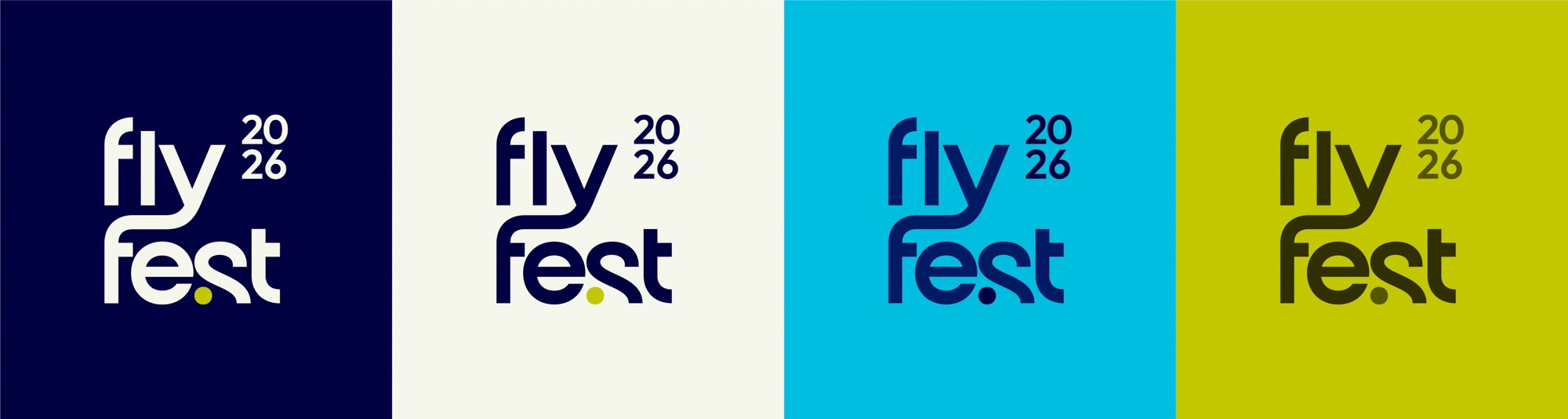
The name Flyfest was already established when the work came to Studio Cherian. The decision was to not over-decorate it, and instead let one idea live quietly inside the letterforms. In the wordmark, the "y" of "fly" is drawn with a curve and a forward slant that lifts away from the baseline. It is the only character in the mark that breaks the geometric uniformity of the system. That asymmetry is the entire concept. A business taking off to the next level. The growth is in the geometry, not in a graphic flourish around it. The mark is set in Surgena, a modern geometric sans with the kind of clean modular construction that reads as precise without becoming sterile. The wordmark is lowercase by design. Most events in the conference and conclave category default to uppercase to signal authority, and Flyfest moved deliberately in the other direction. Lowercase reads as more organic, more approachable, slightly more human, and that small typographic decision does meaningful emotional work for an audience that needed to feel welcomed into a serious room. A period sits under the "s" of "fest" and functions as a precise visual anchor for the mark, holding clarity and focus while carrying the punctuation logic that runs through the wider system. The "26" sits to the right of the wordmark in chartreuse, highlighted not as decoration but because Flyfest was structured as an annual edition. The year is a feature of the brand, not an addendum to it. Two lockups were drawn for the system. A horizontal core wordmark with "26" running alongside, used wherever the mark needed to read at distance or scale. And a stacked square lockup with "2026" set as a two-line block, reserved for close-range applications like ID cards, social tiles, brochures and pamphlets where the full year mark needed to remain legible at smaller scale. Each lockup was drawn with the same logic and the same disciplines, just resolved for a different viewing distance.
The name Flyfest was already established when the work came to Studio Cherian. The decision was to not over-decorate it, and instead let one idea live quietly inside the letterforms. In the wordmark, the "y" of "fly" is drawn with a curve and a forward slant that lifts away from the baseline. It is the only character in the mark that breaks the geometric uniformity of the system. That asymmetry is the entire concept. A business taking off to the next level. The growth is in the geometry, not in a graphic flourish around it. The mark is set in Surgena, a modern geometric sans with the kind of clean modular construction that reads as precise without becoming sterile. The wordmark is lowercase by design. Most events in the conference and conclave category default to uppercase to signal authority, and Flyfest moved deliberately in the other direction. Lowercase reads as more organic, more approachable, slightly more human, and that small typographic decision does meaningful emotional work for an audience that needed to feel welcomed into a serious room. A period sits under the "s" of "fest" and functions as a precise visual anchor for the mark, holding clarity and focus while carrying the punctuation logic that runs through the wider system. The "26" sits to the right of the wordmark in chartreuse, highlighted not as decoration but because Flyfest was structured as an annual edition. The year is a feature of the brand, not an addendum to it. Two lockups were drawn for the system. A horizontal core wordmark with "26" running alongside, used wherever the mark needed to read at distance or scale. And a stacked square lockup with "2026" set as a two-line block, reserved for close-range applications like ID cards, social tiles, brochures and pamphlets where the full year mark needed to remain legible at smaller scale. Each lockup was drawn with the same logic and the same disciplines, just resolved for a different viewing distance.
The name Flyfest was already established when the work came to Studio Cherian. The decision was to not over-decorate it, and instead let one idea live quietly inside the letterforms. In the wordmark, the "y" of "fly" is drawn with a curve and a forward slant that lifts away from the baseline. It is the only character in the mark that breaks the geometric uniformity of the system. That asymmetry is the entire concept. A business taking off to the next level. The growth is in the geometry, not in a graphic flourish around it. The mark is set in Surgena, a modern geometric sans with the kind of clean modular construction that reads as precise without becoming sterile. The wordmark is lowercase by design. Most events in the conference and conclave category default to uppercase to signal authority, and Flyfest moved deliberately in the other direction. Lowercase reads as more organic, more approachable, slightly more human, and that small typographic decision does meaningful emotional work for an audience that needed to feel welcomed into a serious room. A period sits under the "s" of "fest" and functions as a precise visual anchor for the mark, holding clarity and focus while carrying the punctuation logic that runs through the wider system. The "26" sits to the right of the wordmark in chartreuse, highlighted not as decoration but because Flyfest was structured as an annual edition. The year is a feature of the brand, not an addendum to it. Two lockups were drawn for the system. A horizontal core wordmark with "26" running alongside, used wherever the mark needed to read at distance or scale. And a stacked square lockup with "2026" set as a two-line block, reserved for close-range applications like ID cards, social tiles, brochures and pamphlets where the full year mark needed to remain legible at smaller scale. Each lockup was drawn with the same logic and the same disciplines, just resolved for a different viewing distance.


A typography system in two voices
A typography system in two voices
A typography system in two voices
Beyond the wordmark, the type system was built as a deliberate pairing. Surgena, the typeface that draws the wordmark, is a display face. It does precise, modular work in the logo, but it was never built for long copy or running text. Asking it to carry headlines and body across more than eighteen surfaces would have collapsed its purpose. The rest of the typography runs on the Stack Sans family. Stack Sans Headline carries the titles and headlines across the system, doing the expressive work on OOH boards, dashboard headers, session ticket titles, award lines and every moment where the brand needed to land with force. Stack Sans Text carries every line of running copy, captions, utility text, session codes, timestamps and small labels, holding legibility at the smallest scales without losing the voice of the system. The choice was a deliberate division of labour. Stack Sans was selected for the body and headline work because it carries a corporate cleanliness and clarity the audience needed to read fluently across surfaces, without ever feeling decorative or stiff. The two families work together. Surgena holds the brand. Stack Sans carries the conversation.
Beyond the wordmark, the type system was built as a deliberate pairing. Surgena, the typeface that draws the wordmark, is a display face. It does precise, modular work in the logo, but it was never built for long copy or running text. Asking it to carry headlines and body across more than eighteen surfaces would have collapsed its purpose. The rest of the typography runs on the Stack Sans family. Stack Sans Headline carries the titles and headlines across the system, doing the expressive work on OOH boards, dashboard headers, session ticket titles, award lines and every moment where the brand needed to land with force. Stack Sans Text carries every line of running copy, captions, utility text, session codes, timestamps and small labels, holding legibility at the smallest scales without losing the voice of the system. The choice was a deliberate division of labour. Stack Sans was selected for the body and headline work because it carries a corporate cleanliness and clarity the audience needed to read fluently across surfaces, without ever feeling decorative or stiff. The two families work together. Surgena holds the brand. Stack Sans carries the conversation.
Beyond the wordmark, the type system was built as a deliberate pairing. Surgena, the typeface that draws the wordmark, is a display face. It does precise, modular work in the logo, but it was never built for long copy or running text. Asking it to carry headlines and body across more than eighteen surfaces would have collapsed its purpose. The rest of the typography runs on the Stack Sans family. Stack Sans Headline carries the titles and headlines across the system, doing the expressive work on OOH boards, dashboard headers, session ticket titles, award lines and every moment where the brand needed to land with force. Stack Sans Text carries every line of running copy, captions, utility text, session codes, timestamps and small labels, holding legibility at the smallest scales without losing the voice of the system. The choice was a deliberate division of labour. Stack Sans was selected for the body and headline work because it carries a corporate cleanliness and clarity the audience needed to read fluently across surfaces, without ever feeling decorative or stiff. The two families work together. Surgena holds the brand. Stack Sans carries the conversation.


A palette that performs emotion
A palette that performs emotion
A palette that performs emotion
The colour system was designed to do precise emotional work across every surface. Navy was chosen as the dominant ground. It carries the trust, professionalism and gravity that an equity-capital event has to project the moment it is seen. Across OOH boards, event passes, sponsorship materials and digital placements, the navy is the constant. It is what tells the audience that Flyfest is serious work. The primary accent is a chartreuse. It is deliberately not a money green, not a corporate green, not a finance green. It is something more energetic and alive, and it does two pieces of strategic work at once. It signals that Flyfest is an event and not a corporation, that the room is alive and not boardroom-stiff. And it functions as a tonal de-intimidator. The message inside the colour, if it had to be put into words, is *don't be intimidated, approach us to prosper*. For an audience of SME founders unfamiliar with the equity room, that quiet permission is everything. A cyan runs as the secondary accent, extending the same warming function across surfaces that need a second register of energy. A warm off-white sits as the neutral, used for ticket faces, light backgrounds and the surfaces where the system needed to breathe. Each colour has a clear role in the architecture. The navy carries the gravity. The chartreuse and cyan carry the welcome. The cream carries the space. Nothing in the palette is decorative, and nothing is doing two jobs at once.
The colour system was designed to do precise emotional work across every surface. Navy was chosen as the dominant ground. It carries the trust, professionalism and gravity that an equity-capital event has to project the moment it is seen. Across OOH boards, event passes, sponsorship materials and digital placements, the navy is the constant. It is what tells the audience that Flyfest is serious work. The primary accent is a chartreuse. It is deliberately not a money green, not a corporate green, not a finance green. It is something more energetic and alive, and it does two pieces of strategic work at once. It signals that Flyfest is an event and not a corporation, that the room is alive and not boardroom-stiff. And it functions as a tonal de-intimidator. The message inside the colour, if it had to be put into words, is *don't be intimidated, approach us to prosper*. For an audience of SME founders unfamiliar with the equity room, that quiet permission is everything. A cyan runs as the secondary accent, extending the same warming function across surfaces that need a second register of energy. A warm off-white sits as the neutral, used for ticket faces, light backgrounds and the surfaces where the system needed to breathe. Each colour has a clear role in the architecture. The navy carries the gravity. The chartreuse and cyan carry the welcome. The cream carries the space. Nothing in the palette is decorative, and nothing is doing two jobs at once.
The colour system was designed to do precise emotional work across every surface. Navy was chosen as the dominant ground. It carries the trust, professionalism and gravity that an equity-capital event has to project the moment it is seen. Across OOH boards, event passes, sponsorship materials and digital placements, the navy is the constant. It is what tells the audience that Flyfest is serious work. The primary accent is a chartreuse. It is deliberately not a money green, not a corporate green, not a finance green. It is something more energetic and alive, and it does two pieces of strategic work at once. It signals that Flyfest is an event and not a corporation, that the room is alive and not boardroom-stiff. And it functions as a tonal de-intimidator. The message inside the colour, if it had to be put into words, is *don't be intimidated, approach us to prosper*. For an audience of SME founders unfamiliar with the equity room, that quiet permission is everything. A cyan runs as the secondary accent, extending the same warming function across surfaces that need a second register of energy. A warm off-white sits as the neutral, used for ticket faces, light backgrounds and the surfaces where the system needed to breathe. Each colour has a clear role in the architecture. The navy carries the gravity. The chartreuse and cyan carry the welcome. The cream carries the space. Nothing in the palette is decorative, and nothing is doing two jobs at once.


A pattern that gathers, never crowds
A pattern that gathers, never crowds
A pattern that gathers, never crowds
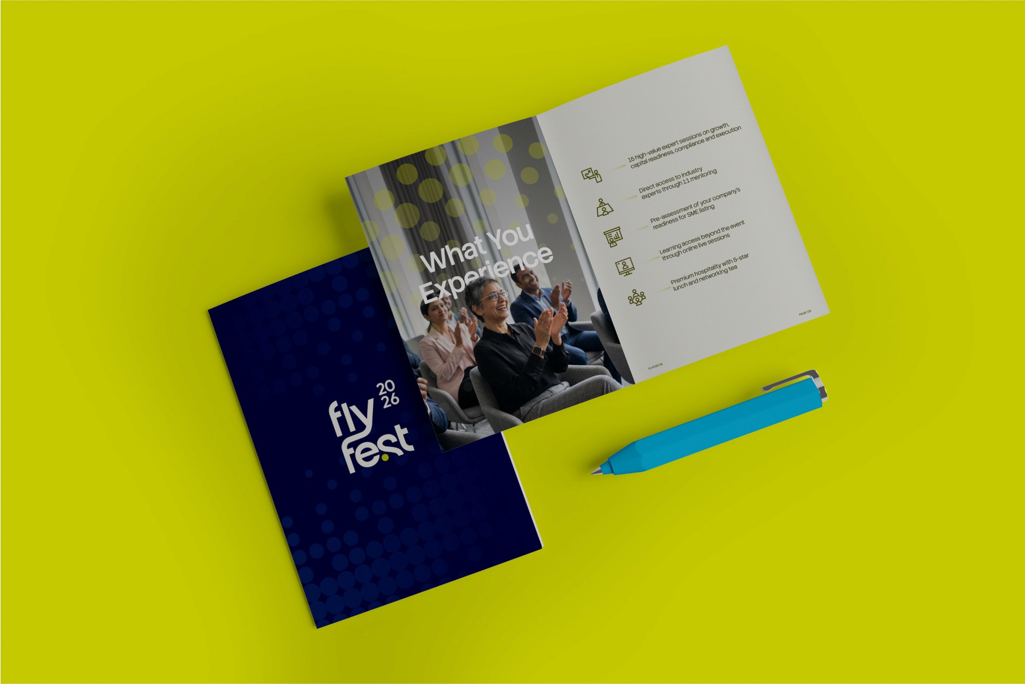
A dot pattern runs through the visual system as the connective tissue between surfaces. It appears on session tickets, lanyards, OOH boards, digital placements and emailers, always at a deliberately restrained density. The pattern represents gathering, the coming together of a small, specific group of people around a shared opportunity. Crucially, it is never allowed to fill the surface. The pattern is sparse by design, and that sparseness is doing strategic work. Flyfest was conceived as a curated event for growth-ready SMEs, not a mass conference open to anyone with a registration link. The exclusivity of the audience had to be felt in the visual system, and the visual system communicates it not through gold borders or premium iconography but through the simple discipline of restraint. The dots gather. They never crowd. The pattern was developed as a freeform system rather than a rigid mathematical grid, applied at the discretion of the art director and designers across each surface. That choice was a deliberate one. It kept the work feeling crafted rather than templated across so many applications, and it allowed the pattern to behave differently when the surface asked for it, holding tension on a billboard, holding breath on a pass.
A dot pattern runs through the visual system as the connective tissue between surfaces. It appears on session tickets, lanyards, OOH boards, digital placements and emailers, always at a deliberately restrained density. The pattern represents gathering, the coming together of a small, specific group of people around a shared opportunity. Crucially, it is never allowed to fill the surface. The pattern is sparse by design, and that sparseness is doing strategic work. Flyfest was conceived as a curated event for growth-ready SMEs, not a mass conference open to anyone with a registration link. The exclusivity of the audience had to be felt in the visual system, and the visual system communicates it not through gold borders or premium iconography but through the simple discipline of restraint. The dots gather. They never crowd. The pattern was developed as a freeform system rather than a rigid mathematical grid, applied at the discretion of the art director and designers across each surface. That choice was a deliberate one. It kept the work feeling crafted rather than templated across so many applications, and it allowed the pattern to behave differently when the surface asked for it, holding tension on a billboard, holding breath on a pass.
A dot pattern runs through the visual system as the connective tissue between surfaces. It appears on session tickets, lanyards, OOH boards, digital placements and emailers, always at a deliberately restrained density. The pattern represents gathering, the coming together of a small, specific group of people around a shared opportunity. Crucially, it is never allowed to fill the surface. The pattern is sparse by design, and that sparseness is doing strategic work. Flyfest was conceived as a curated event for growth-ready SMEs, not a mass conference open to anyone with a registration link. The exclusivity of the audience had to be felt in the visual system, and the visual system communicates it not through gold borders or premium iconography but through the simple discipline of restraint. The dots gather. They never crowd. The pattern was developed as a freeform system rather than a rigid mathematical grid, applied at the discretion of the art director and designers across each surface. That choice was a deliberate one. It kept the work feeling crafted rather than templated across so many applications, and it allowed the pattern to behave differently when the surface asked for it, holding tension on a billboard, holding breath on a pass.


The Outcome
The Outcome
The Outcome
The complete visual identity system was developed, presented and delivered to Tzvao Group. The work was received well, and the engagement continued into the design of further collateral including brochures and stationery before Tzvao Group called the event off for internal organisational reasons unrelated to the design work. Flyfest 2026 never reached a live audience. The identity exists as a fully resolved piece of design work that was never activated. The work stands on what it is rather than on what it became. Flyfest 2026 is a demonstration of how Studio Cherian builds a visual system around the specific psychology of an audience, in this case an audience of growth-ready SME founders who needed the room to feel both serious and accessible. The typographic discipline of the wordmark. The calibration of warmth and seriousness across the colour decisions. The system thinking that held the work together across more than eighteen surfaces. The depth of application thinking that turned every touchpoint from a deliverable into a considered piece of the whole. Each of those is the case study, regardless of whether the event itself took place. For a future client commissioning a serious identity system, Flyfest 2026 is the work to look at when the question is whether a studio can think strategically about who the audience is, what they need to feel, and what design has to do to make them feel it.
The complete visual identity system was developed, presented and delivered to Tzvao Group. The work was received well, and the engagement continued into the design of further collateral including brochures and stationery before Tzvao Group called the event off for internal organisational reasons unrelated to the design work. Flyfest 2026 never reached a live audience. The identity exists as a fully resolved piece of design work that was never activated. The work stands on what it is rather than on what it became. Flyfest 2026 is a demonstration of how Studio Cherian builds a visual system around the specific psychology of an audience, in this case an audience of growth-ready SME founders who needed the room to feel both serious and accessible. The typographic discipline of the wordmark. The calibration of warmth and seriousness across the colour decisions. The system thinking that held the work together across more than eighteen surfaces. The depth of application thinking that turned every touchpoint from a deliverable into a considered piece of the whole. Each of those is the case study, regardless of whether the event itself took place. For a future client commissioning a serious identity system, Flyfest 2026 is the work to look at when the question is whether a studio can think strategically about who the audience is, what they need to feel, and what design has to do to make them feel it.
The complete visual identity system was developed, presented and delivered to Tzvao Group. The work was received well, and the engagement continued into the design of further collateral including brochures and stationery before Tzvao Group called the event off for internal organisational reasons unrelated to the design work. Flyfest 2026 never reached a live audience. The identity exists as a fully resolved piece of design work that was never activated. The work stands on what it is rather than on what it became. Flyfest 2026 is a demonstration of how Studio Cherian builds a visual system around the specific psychology of an audience, in this case an audience of growth-ready SME founders who needed the room to feel both serious and accessible. The typographic discipline of the wordmark. The calibration of warmth and seriousness across the colour decisions. The system thinking that held the work together across more than eighteen surfaces. The depth of application thinking that turned every touchpoint from a deliverable into a considered piece of the whole. Each of those is the case study, regardless of whether the event itself took place. For a future client commissioning a serious identity system, Flyfest 2026 is the work to look at when the question is whether a studio can think strategically about who the audience is, what they need to feel, and what design has to do to make them feel it.


(03)
PROJECTS